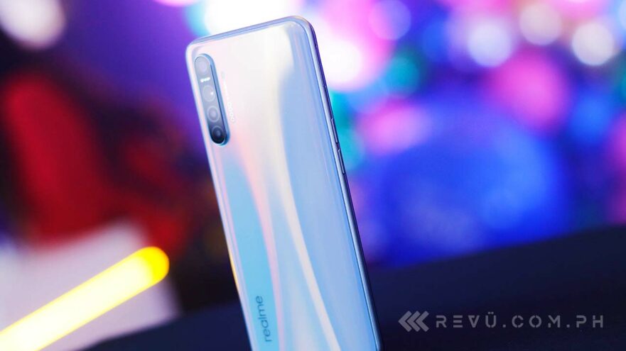
Realme has started rolling out its in-house Android interface to some devices, including the Realme 3 Pro and XT. Realme UI first launched on the X50, and now it’s available to download for some users in India. As we’re looking at a staged rollout here, it may not have hit your device yet.
(Update, January 31: Finally, an official method! Read Official method: Updating Realme 3 Pro, XT to Realme UI manually.)
(Update, January 26: Got an over-the-air Realme UI update on our Realme XT! Read How to update your Realme 3 Pro, Realme XT to Realme UI.)
SEE ALSO: Here’s Realme UI’s updated release schedule and OPPO ColorOS 7 initial review: One of Android’s best UIs
Realme UI is based on Google’s latest Android 10 operating system and brings many new features like a fresh layout, redesigned icons, a better dark-mode experience, and performance improvements that are integral to any software upgrade. Perhaps more importantly, it completes a major business goal of Realme to completely detach itself from OPPO, its former parent company, and chart its own path in the industry.
We managed to install Realme UI on our Realme 3 Pro using a custom recovery. So far, we’ve had no success in getting the new software to run on our Realme XT unit, which is unfortunate, as some features of Realme UI are limited to phones with better hardware.
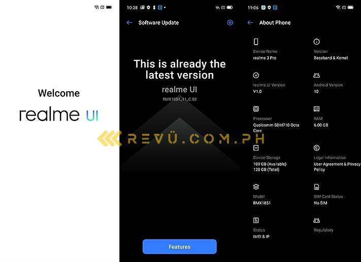
We’ve installed Realme UI on our Realme 3 Pro using a custom recovery. So far, we’ve had no success in getting the new software to run on our Realme XT unit
Realme Philippines has yet to provide a rollout schedule for Realme UI for the local market, but the fact that it’s out now for some users in India indicates a wider release could be just around the corner.
Of course, you can always manually update your device if you want to try out Realme UI’s new features like we did, though we don’t recommend doing it unless you’re familiar with the ins and outs of unlocking a bootloader and flashing a custom recovery.
READ ALSO: Realme 3 Pro review: Pro performance and features for less and Realme XT review: The best Realme in the Philippines yet
If those terms don’t ring a bell, it basically means you’re better off waiting for an over-the-air software update rather than running the risk of bricking your phone and voiding warranty.
On to our first impressions, then.
Realme UI vs. ColorOS 6 on Realme
The first thing that stands out to us is the all-new layout and visual style. Realme UI looks much better than ColorOS 6 on Realme devices, though comparisons can definitely be made to OPPO’s ColorOS 7.
That’s pretty much anticipated, if not expected, considering both are based on Android 10 and the history between the two companies responsible for them. The two even share several static and live wallpapers — a good thing, seeing how nice they look.
Realme and OPPO share several static and live wallpapers — a good thing, seeing how nice they look, such as the example above
Animations are more sophisticated and responsive than ever. The way Realme UI reacts to navigation gestures — when you close an app and return to the home screen, or bring up the multitask window, for example — shows some great attention to detail.
The notification area now has a solid background color across the entire panel, as opposed to an opaque gray. Since it’s based on Android 10, the new software also allows you to reply directly from the notification panel.
The notification area now has a solid background color across the entire panel, as opposed to an opaque gray
The icons look nicer, slightly smaller, and they have a more consistent general aesthetic. Unlike on the previous software, you can set the icon style by diving into the Settings page as well as pick between different icon borders, sizes, and color schemes. However, we personally prefer the default setting with circular icons.
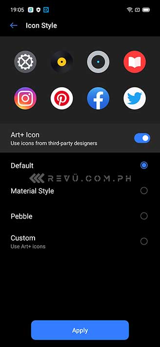
You can now set the icon style by diving into the Settings page as well as pick between different icon borders, sizes, and color schemes
From wallpapers to icon packs to lock screens, there’s a whole host of customization options here, far outnumbering the settings available on ColorOS. If Realme set out to make an interface that allows enough creative freedom for users to make it their own, it seems to have achieved that.
From wallpapers to icon packs to lock screens, there’s a whole host of customization options on Realme UI, far outnumbering the settings available on OPPO’s ColorOS
The layout of the stock camera app is different, too. It’s more intuitive, easier to use, and the toggles take up less space, so you see more of them in a single view. This improved user interface reminds us of Huawei’s camera app on EMUI 9 and later.
As for performance, Realme UI feels slick and fluid, and we haven’t encountered any issues with our Realme 3 Pro in the period we’ve been using it after the software update. Keep in mind the version of Realme UI we’re using is a finalized public release and not a beta build, so the stability is not a surprise at all. As a daily driver, it’s rock solid.
SEE ALSO: Realme 5i: Camera specs, sample pictures and Realme Buds Air review: Good audio, even better price
The Game Space app from ColorOS 6 is missing from the version of Realme UI we installed, so we’re skipping the gaming analysis for now. If you’re really curious, we tested NBA 2K20 and Mobile Legends; both run without issues at high settings on our unit.
Realme UI has a revamped Smart Sidebar feature as well, similar to OPPO’s ColorOS 7. It now takes up less space on the screen, as it integrates app and quick commands in a single column. Adding your favorite apps to the sidebar makes it easier to multitask. You can still move the sidebar to the left or right of the screen to suit your preference.
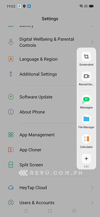
Realme UI has a revamped Smart Sidebar feature similar to OPPO’s ColorOS 7
Talking about improvements, here’s a rundown of other notable features that you might be interested in:
Dark mode
Dark mode is already available on ColorOS 6, but Realme UI brings it up another level. Realme’s implementation can be scheduled for a set time within the day, which is something you don’t get on Android 10 and the previous software. Further, it seems to support more third-party apps, although this added function is still in beta, so you might experience a few snags along the way.
Realme’s dark-mode implementation can be scheduled for a set time within the day
Dual earphones
This feature lets you use a pair of wired earphones while connected to wireless earbuds. You can enable it to play the same audio on both the wired and wireless earphones, or use wired earphones for media and wireless buds for phone audio. This should prove useful if you want to share audio with the person next to you.
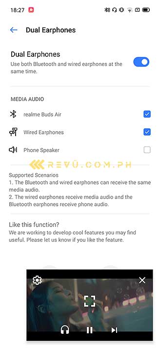
Dual Earphones lets you use a pair of wired earphones while connected to wireless earbuds
Random MAC address
Like on ColorOS 7, Realme UI will let you randomize your MAC address to improve your phone’s security and privacy. A MAC or Media Access Control address is a unique identifier that can be used to track individual devices on Wi-Fi networks. In the wrong hands, it might be used to gain access to your Wi-Fi network and leave it, as well as connected devices, prone to malicious attacks.
Like on ColorOS 7, Realme UI will let you randomize your MAC address to improve your phone’s security and privacy
Double-tap to lock
As the name suggests, this will enable double-tap-to-lock function on your device. So, instead of pressing the power button, or creating a shortcut on the home screen, you will just have to double-tap an empty area on the home screen to turn off and lock the screen.
Realme Share
Like OPPO Share on ColorOS 7, Realme Share is now compatible with OPPO, Vivo, and Xiaomi devices that run Android 10 (click on this to see our demo). This lets users quickly share big files from one Android device to another. It uses Bluetooth for pairing and W-Fi P2P (Peer to Peer) to achieve transfer speeds up to 20MB per second.
Initial impressions
Realme UI is a big step in the right direction. It will give Realme handsets a well-deserved polish and introduce new features that users will find helpful and easy to use. It also gives the company’s devices their own identity, although it’s one that some people may inevitably attribute to OPPO.
We hope Realme can begin a global rollout soon, so we can see its full potential emerge on devices with better specs.
Share this Post


