As expected, the Meizu M2 Note went on sale on Lazada Philippines four days ago. (It’s still available, as of this posting, for P6,990.) Out of curiosity, I decided to purchase one on the first day of sale, and Lazada delivered the unit in a bubble-wrapped cocoon to my address Thursday morning, probably because I happen to live just an hour away from the company’s warehouse in Metro Manila.
So here we are, two days later, and, as I tend to do, I’ll be sharing with you my impressions and whether or not this Android challenger from China deserves a spot on your smartphone shortlist in case you’re in the market for something that won’t burn through your bank account.
Should Meizu’s second attempt at a big-screen phone with mid- to high-end specs be mentioned in the same breath as some of the better value-for-money options out there like the ASUS Zenfone 2 and Lenovo A7000? Read on to find out.
Meizu M2 Note specs (Price in the Philippines: P6,990):
* Dual SIM with LTE support
* 1.3GHz 64-bit, octa-core MediaTek MT6753 CPU
* Mali-T720 MP3 GPU
* 2GB RAM
* 16GB/32GB internal storage
* microSD card slot (up to 128GB)
* 5.5-inch IGZO display (1,080 x 1,920 resolution)
* 13-megapixel rear camera with dual-LED flash
* 5-megapixel front camera
* 3,100mAh battery
* Android Lollipop 5.1
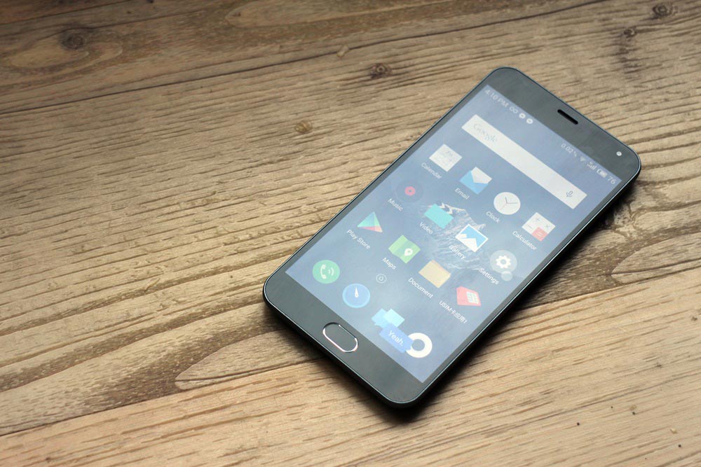
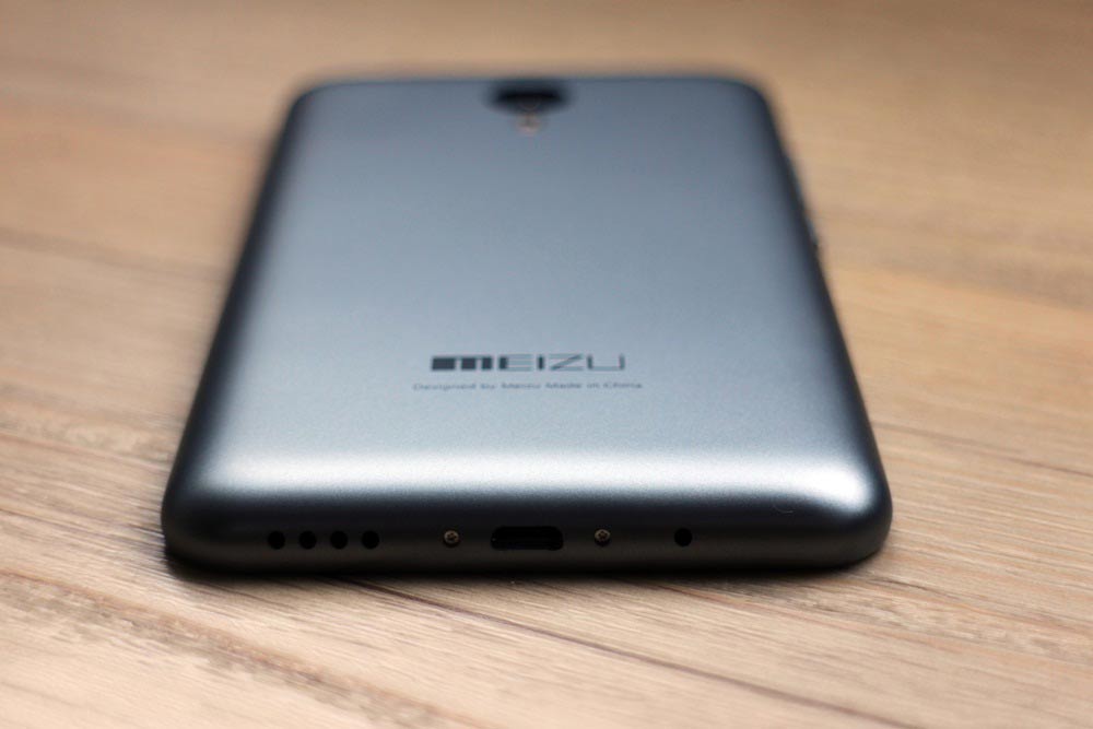
The Meizu M2 Note is a somewhat well-designed phone that doesn’t skimp on build quality, as evidenced by a solid unibody construction that keeps the parts to a minimum. Perhaps the most striking aspect of its exterior is the fact that it maintains a compact body, with Meizu managing to keep the thickness to under 9mm and shrink the top, bottom, and side bezels to a size that lends well to one-handed use.
And while some people may mistake the M2 Note for an iPhone 5c at first blush, because of its physical home button and curved, colored plastic back, Meizu has done enough with its latest offering to distinguishing it from a now-crowded field, if you think about it. The gray model in particular has a matte finish, as opposed to the glossy sheen of Apple’s mid-range handset. Besides, there are only so many ways you can make a full touchscreen phone.
The most striking aspect of the M2 Note’s exterior is the fact that it maintains a compact body, with Meizu managing to shrink the top, bottom, and side bezels to a size that lends well to one-handed use.
And speaking of ways to build a phone, most manufacturers don’t find it necessary to add a physical home button to the hardware — perhaps even more so when it doesn’t include a fingerprint sensor — but Meizu decided on giving the M2 Note the Samsung Galaxy treatment.
I’m not against it — it doesn’t take up a lot of space on the phone’s chin, anyway — but I would have wanted to have seen better execution on Meizu’s part. A home button that’s not as awkward to push and has more tactile response would be a great start. Throwing in a fingerprint scanner, similar to what Firefly Mobile’s ODM did with the P7,999 Allure 64 LTE, wouldn’t hurt either.
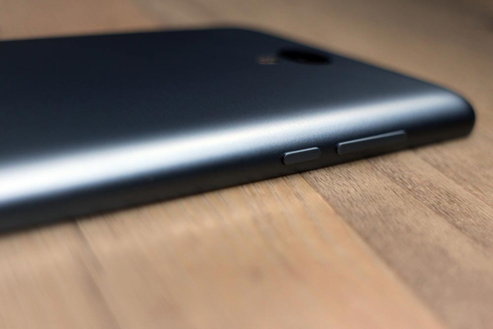
The remaining buttons on the M2 Note, namely the power key and volume rocker, offer a slightly better experience, though their placement on the left-hand side of the device suggests a bias towards ambidextrous and left-handed users. (Quick disclosure: I’m right-handed; naturally, I prefer devices with buttons mounted on the right-side rail.)
I’m not against the phone’s physical home button — it doesn’t take up a lot of space on the phone’s chin, anyway — but I would have wanted to have seen better execution on Meizu’s part.
The audio blasting from the downward-firing speaker is a little rough but loud enough to drown out ambient noise. However, it bears noting that the M2 Note, unlike most handsets, doesn’t come with its own set of headphones, but it does have a headphone jack sitting along the top-left edge, beside one of the mics.
As for picture quality, the 5.5-inch touchscreen fronting the M2 Note doesn’t disappoint, and it is without a doubt one of the best displays I’ve seen on any smartphone in the sub-P10,000 segment. In addition to 1080p visuals, the screen makes use of Sharp’s IGZO (Indium Gallium Zinc Oxide) technology, which should translate to better battery life (more on this later) and improved touchscreen sensitivity.
Maximum brightness is high, and viewing angles are wide enough to share a movie with another person without butting heads like a pair of enraged mountain goats. Color temperature is consistently warm, which I prefer because it’s easier on the eyes.
You won’t get the deepest blacks and brightest whites as you would on a Samsung Galaxy S6, but the M2 Note should be more than good enough for most tasks. Meizu even offers the option to take the color temperature up a notch to give the panel the cooler, bluish-white nuance you want.
The 5.5-inch touchscreen fronting the M2 Note doesn’t disappoint, and it is without a doubt one of the best displays I’ve seen on any smartphone in the sub-P10,000 segment.
Another bright spot is imaging performance; the phone’s 13- and 5-megapixel rear and front cameras do an impressive job of reproducing colors and squeezing in a good amount of sharpness and detail in a wide range of lighting conditions.
Shutter lag is barely noticeable, so if you’re moving up from an entry-level handset, you’ll likely be able to nail shots that would otherwise be missed by your old device. Additionally, the f/2.2 lens around the back of the M2 Note allows for a shallow depth of field when taking close-up shots. As for Meizu’s native camera app, it doesn’t have a bucket-load of shooting modes available, but it covers all the basics you’d expect from a 2015 release: Auto, Manual, Beauty, Panorama, HDR, Scan (for QR codes), and Slow Motion (for video).
Specs-wise, the unit I have comes with dual-SIM slots (for nano SIMs) and a 64-bit, 1.3GHz octa-core MediaTek MT6753 processor with Mali-T720 graphics and 2GB of RAM. There’s a good selection of connectivity options on offer as well, with dual-band WiFi (2.4GHz and 5GHz), 4G LTE (FDD- and TDD-LTE), GPS, and Bluetooth all supported.
Internal storage maxes out at 16GB, but it can be expanded up to an additional 128GB via microSD expansion; however, doing so would effectively turn the M2 Note into a single-SIM device, as the first SIM slot doubles as the microSD card slot.
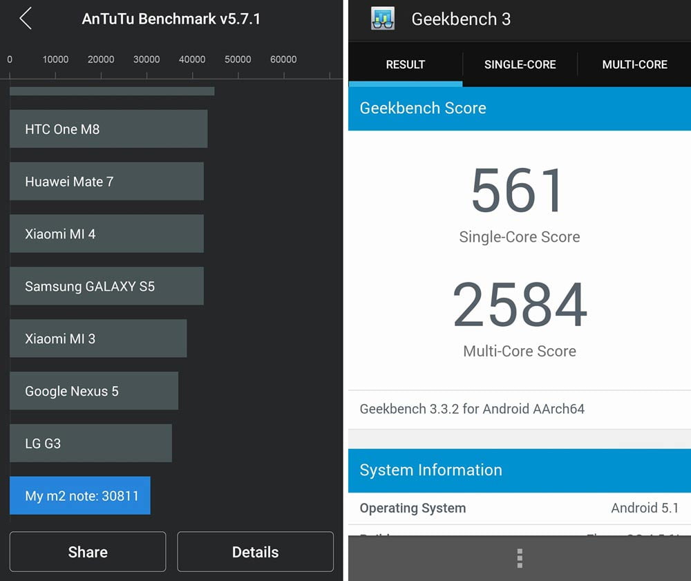
AnTuTu Benchmark (left) and Geekbench 3 (right) scores
If the stuff under the hood looks familiar, that’s because the M2 Note shares most of its predecessor’s silicon, which may sound odd given the trend among manufacturers to opt for faster internals. Meizu actually did the opposite, and instead built a smartphone sequel rocking a newer, albeit slower, processor, hoping that consumers would be willing to sacrifice a bit of performance for better battery mileage.
It’s a risky move that seemingly pays off, as the M2 Note, with its more efficient (read: lower-clocked) processor, manages to deliver a fantastic usage experience that surpasses most devices in its class. Despite the limits imposed by a slower clock rate, it remains a pretty powerful hardware that punches above its weight. Graphically-intensive games run smoothly; switching between apps is quick and seamless; and on-screen animations are fluid.
Meizu built a smartphone sequel rocking a newer, albeit slower, processor, hoping that consumers would be willing to sacrifice a bit of performance for better battery mileage. It’s a risky move that seemingly pays off.
On the latest versions of AnTuTu Benchmark and Geekbench 3, my unit ended up with a score of 30,811 and 2,584 (for the multi-core test), respectively. Not elite numbers by any stretch, but not awful either, especially if you consider the M2 Note’s price.
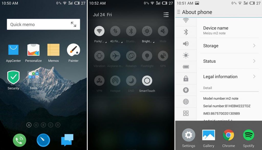
The M2 Note runs Meizu’s own Flyme OS on top of Android Lollipop 5.1 — not that you’d notice in day-to-day use. The custom skin doesn’t look quite like vanilla Android, nor does it provide a familiar navigation experience to anyone who’s used an Android device.
Meizu’s user interface lacks an app drawer, so every app you install will take up space on the home screen. Sure, it’s possible to group apps into folders, but that compromise may not appeal to some. The absence of notifications on the lock screen also doesn’t show the software in a good light.
The M2 Note runs Meizu’s own Flyme OS on top of Android Lollipop 5.1 — not that you’d notice in day-to-day use. It doesn’t look quite like vanilla Android, nor does it provide a familiar navigation experience.
But perhaps the most polarizing thing on the software front is Meizu’s questionable attempt to revamp Android’s default navigation controls by switching to a one-button scheme and relying on swipes and gestures to accomplish most tasks. So instead of, say, Meizu adding a recent-apps shortcut beside the home button to make switching between apps a little easier, the company opted instead for a swipe-up gesture from the bottom of the screen, which is harder to do than tapping a capacitive or software key.
Meizu’s Flyme OS interface
The M2 Note’s 3,100mAh non-removable battery seems like a step back or at least a non-improvement from the original’s 3,140mAh cell, but that doesn’t stop it from providing enough power to get you through a full day — and then some. Suffice to say, battery life in the M2 Note was such that I never really worried about running out of juice on the road.
In my anecdotal video-loop test, the device clocked in 8 hours and 52 minutes, which is longer than today’s smartphone average of 8 hours. Sharp’s IGZO display technology may have had a hand in that stat, but I can’t prove it.
The most polarizing thing on the software front is Meizu’s questionable attempt to revamp Android’s default navigation controls by switching to a one-button scheme and relying on swipes and gestures to accomplish most tasks.
With the Meizu M2 Note, the company proves yet again that you don’t have to spend top money to get top hardware that hits harder than its price suggests. My only gripe — and it’s a big one — has to do with the software that runs the whole show; though it succeeds in giving Android a fresh, if unsolicited, makeover, the resulting experience detracts from an otherwise compelling package.
But if you can bear the system-wide overhaul Meizu gave to Android — and I know many of you will — then by all means, take a long, hard look at the M2 Note. If you need something that delivers on many levels without breaking the bank, you can hardly do better than this.
Meizu M2 Note unboxing video
Share this Post


